Real-time Translation Tool Redesign at Tyson Foods
Making onboarding easier for multilingual workers.
“Employers must teach workers in a language and vocabulary they understand.” — Occupational Safety and Health Administration (OSHA)
A Tool That Nobody Wanted to Use
In response to the OSHA rule, Tyson Foods built a translation app for plant onboarding. Instructors speak in English while new hires get real-time translations on their tablets.
This app was expected to have a huge impact — serving over 50,000 new hires every year across 165 plants. However, people didn’t want to use it — both usage and satisfaction was low since its 2023 launch.
In August 2024, I joined the team to redesign the entire app, aiming to improve adoption and user satisfaction.
Understanding the Real Problem
To find out why people weren’t using it, we decide to go directly to the source. We made 2 site visits to local Tyson plants, sitting in onboarding classrooms to observe what happened.
 [fig 1] A typical onboarding classroom setting: learning lead standing and talking, and new hires sitting and listening.
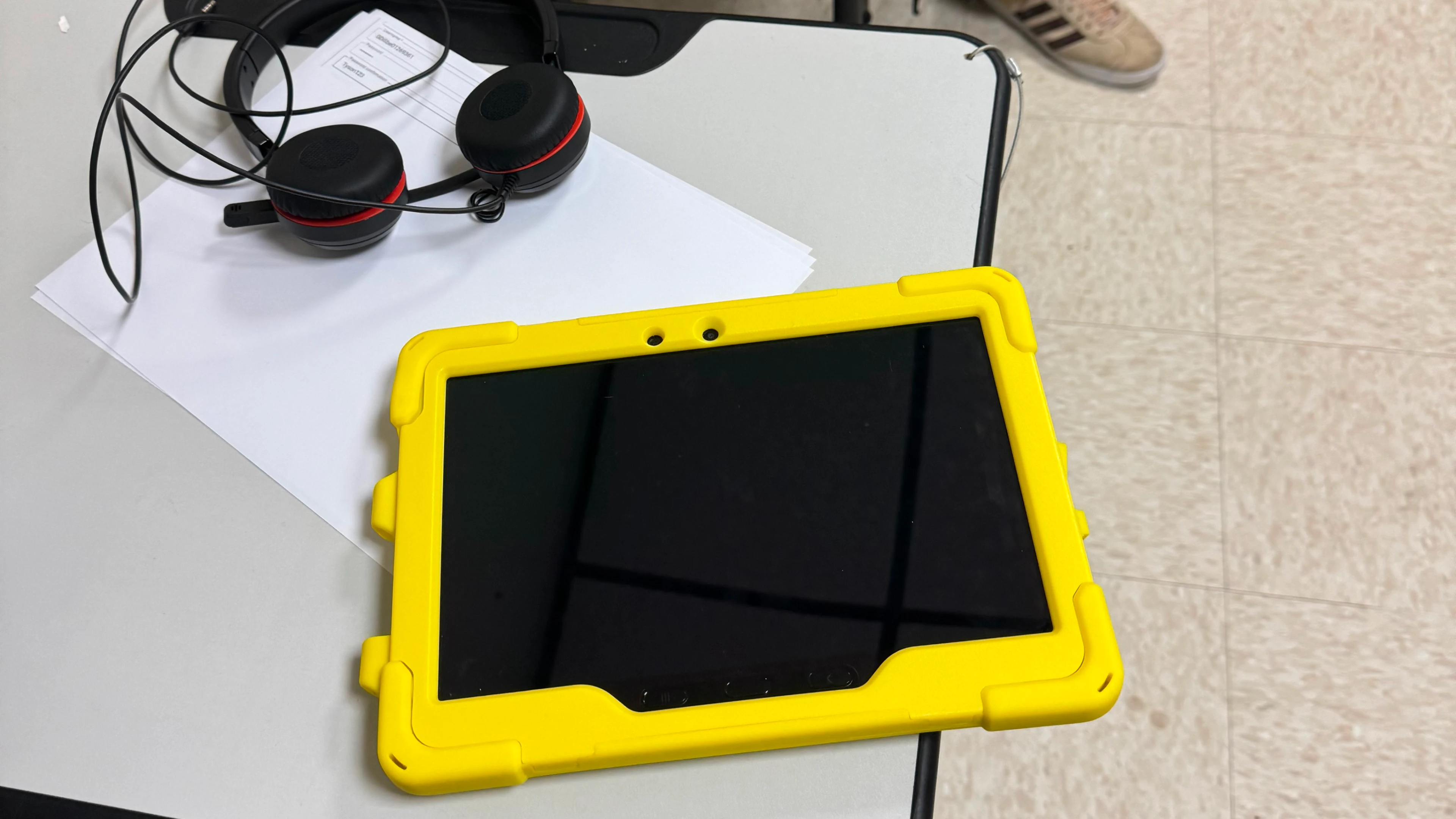 [fig 2] Devices used during onboarding sessions: a tablet and headphones.
Those visits revealed pain points we never would have discovered through remote user interviews. For example, people sitting at the very back couldn’t clearly see the chat code displayed on classroom TVs — a simple but critical usability barrier.
We mapped all observed issues into a user journey and validated them with the team. The problems fell into 2 categories: Infrastructure challenges — such as unreliable WiFi and translation accuracy — that required significant technical investment, and UI friction points that could be addressed quickly.
The UI friction points clustered around 3 themes:
- Complex navigation and unfamiliar terminology made initial app onboarding slow and difficult
- Lack of clear visual feedback left users confused about what was happening, causing them to lose focus
- Poor mobile optimization — such as small touch targets — made the app difficult to use on tablets
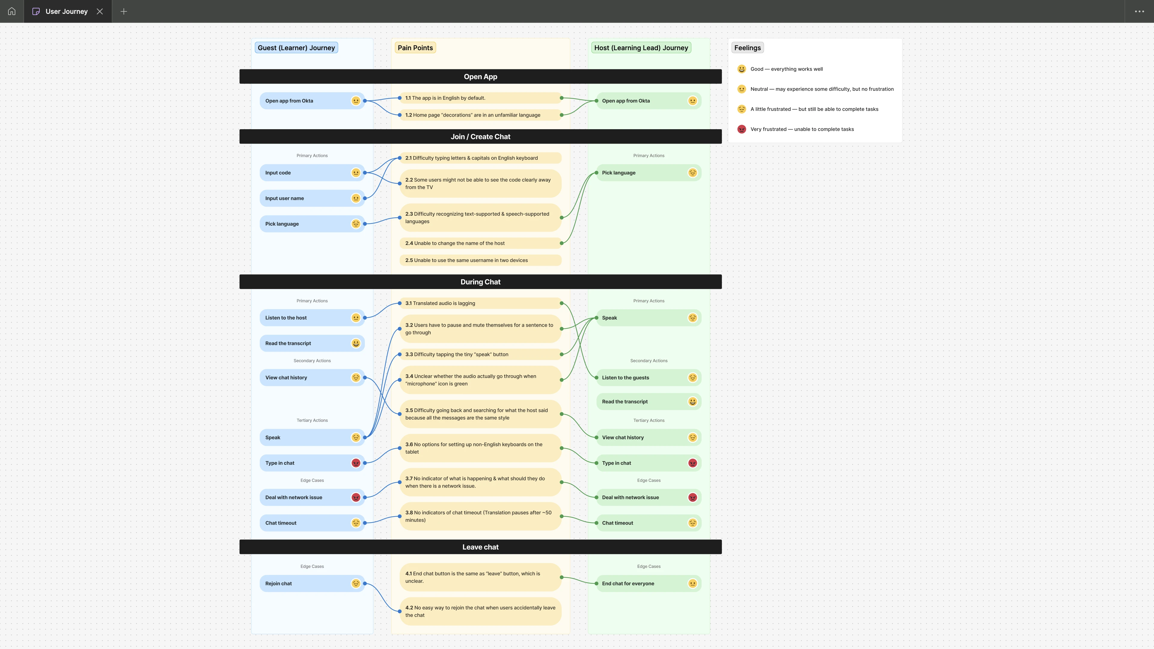 [fig 3] User journey map with pain points
Our Solution
We decided to focus on the UI friction points first, as they were quick wins that could demonstrate immediate value. Our solution — UI improvements — then followed the 3 principles that directly responded to each problem theme.
1. Make it Fast & Easy
To make the overall flow fast & easy, we:
- Simplified vocabulary throughout, using "Chat" instead of "Conversation" and "People" instead of "Participant"
- Reduced steps wherever possible by auto-filling usernames from account settings (users can change to a preferred name if needed)
[video 1] Making the flow to join the meeting as fast & easy as possible.
2. Help User Focus
To help users focus on listening to translations and viewing content, we:
- Used minimal design throughout the app
- Applied special colors to highlight important information
- Added sound wave to show the audio input
[video 2] Using sound waves to show audio input status.
3. Optimize for Devices
We redesigned the interface for optimal tablet use in classroom settings:
- Larger touch targets for easier interaction
- Responsive layouts optimized for tablet & mobile screens
- Added an option for instructors to enlarge chat codes on TV displays so workers in back rows can see clearly
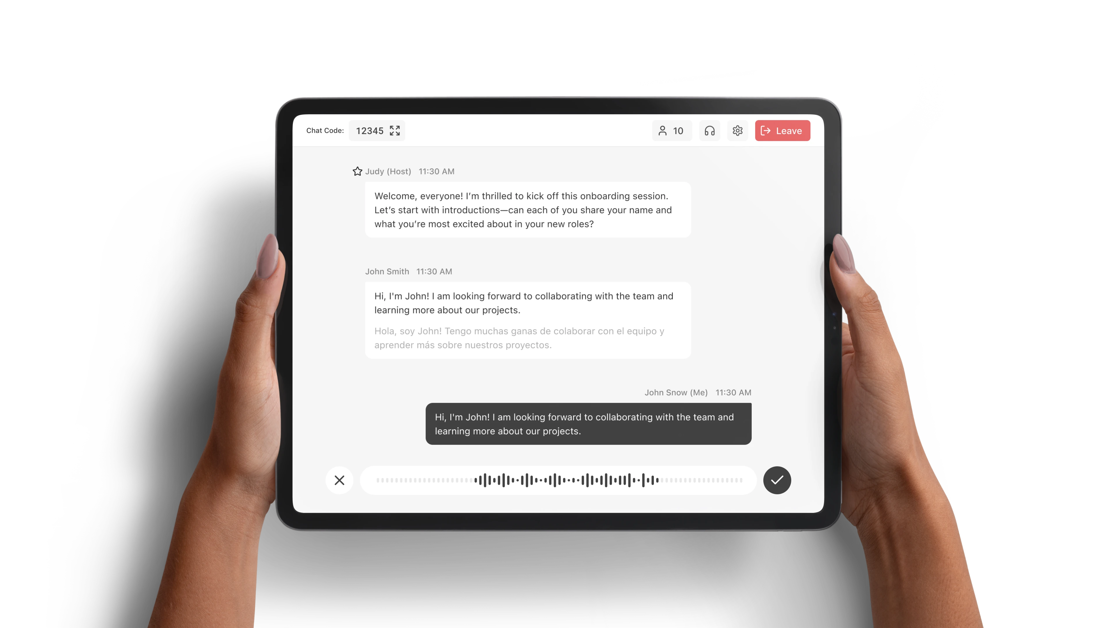
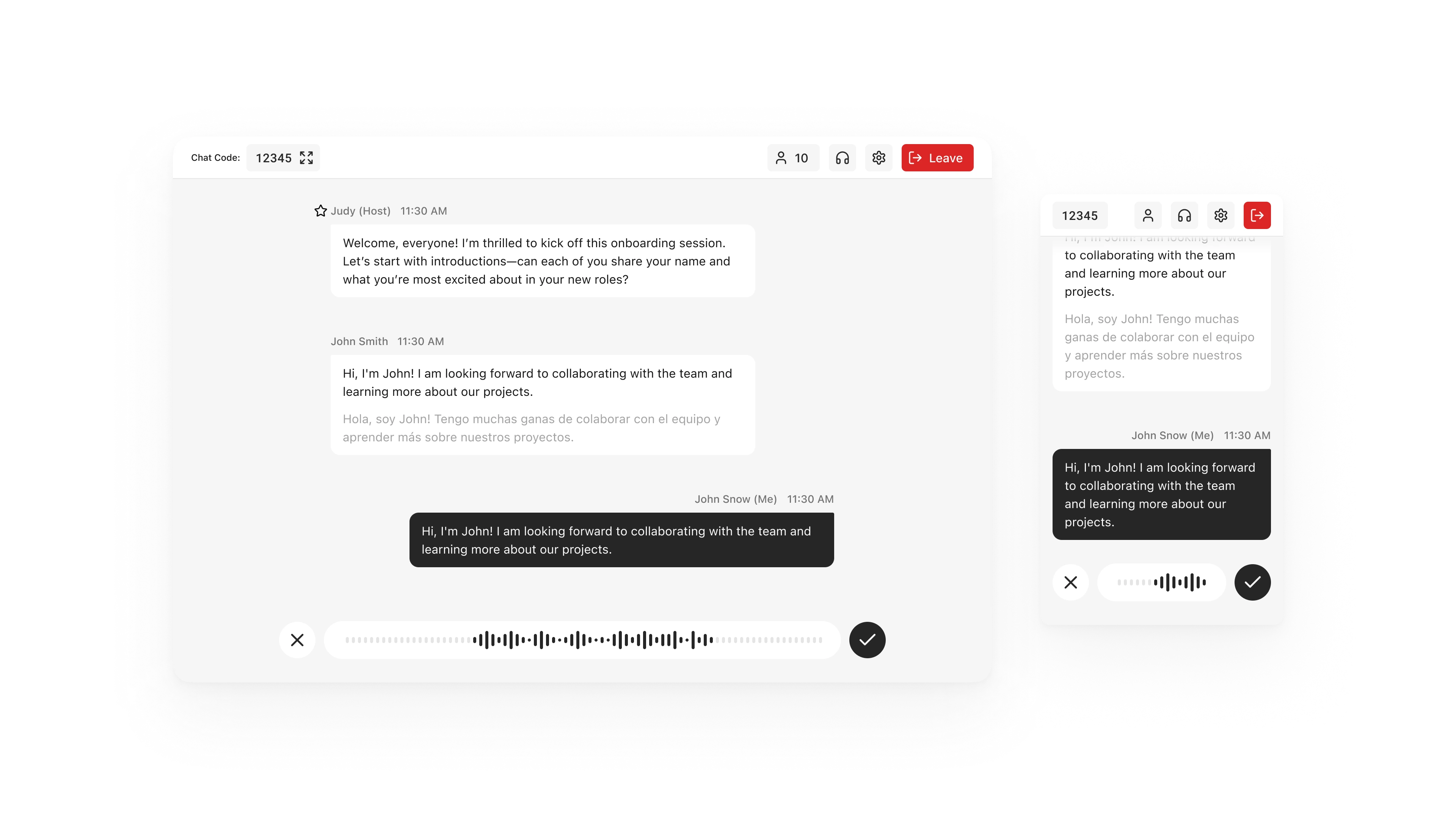 [fig 4] Optimized design for both mobile and tablet.
[video 3] Enlarging the chat code for TV display.
Result
User satisfaction improved significantly after the redesign, measured by routine user satisfaction surveys conducted before (July) and after (December) the redesign:
- Average rating increased from 2.6/5 to 4.2/5 (62% improvement)
- User sentiment shifted dramatically from Low ratings (1-2 stars) to High ratings (5 stars)
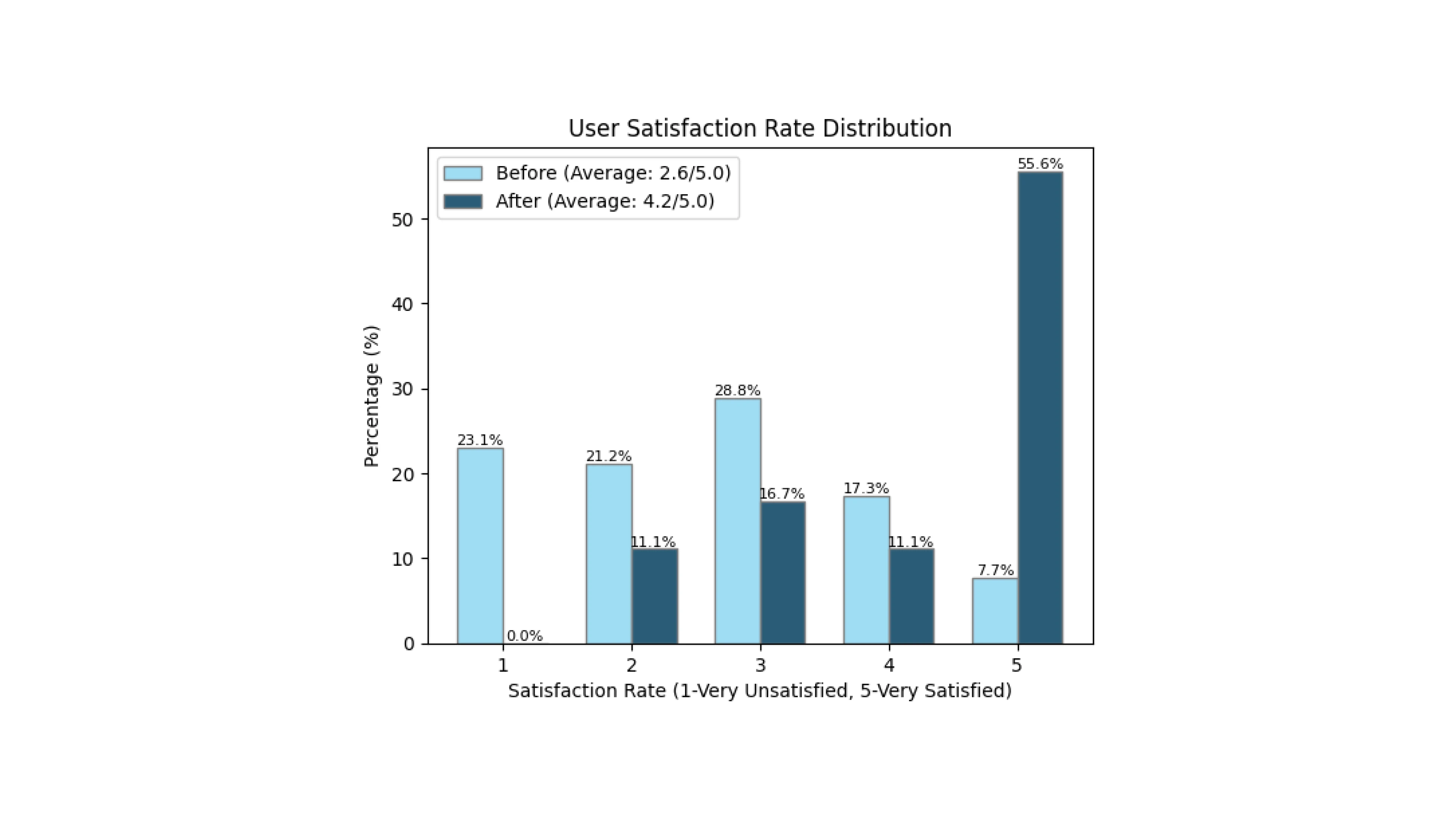 [fig 5] User satisfaction rate before and after the improvement.
Acknowledgement
Acknowledgement of this super small but super cool project team: Joe Klingaman, Senior Project Manager, Rohit Kala, Full-stack Developer, Jayce Martin, Senior Full-stack Developer, and Kay Zhang (Me), UX Designer.