BOM Portal Redesign at Tyson Foods
Beyond the giant spreadsheet of enterprise systems.
"This is just a giant excel spreadsheet." — BOM stakeholder during interview
At the end of the day, enterprise software is just data — tremendous amounts of data. The challenge isn't having the data, but making it work for the people who use it every day.
A Legacy App That Records How Much It Takes to Make Chicken Nuggets
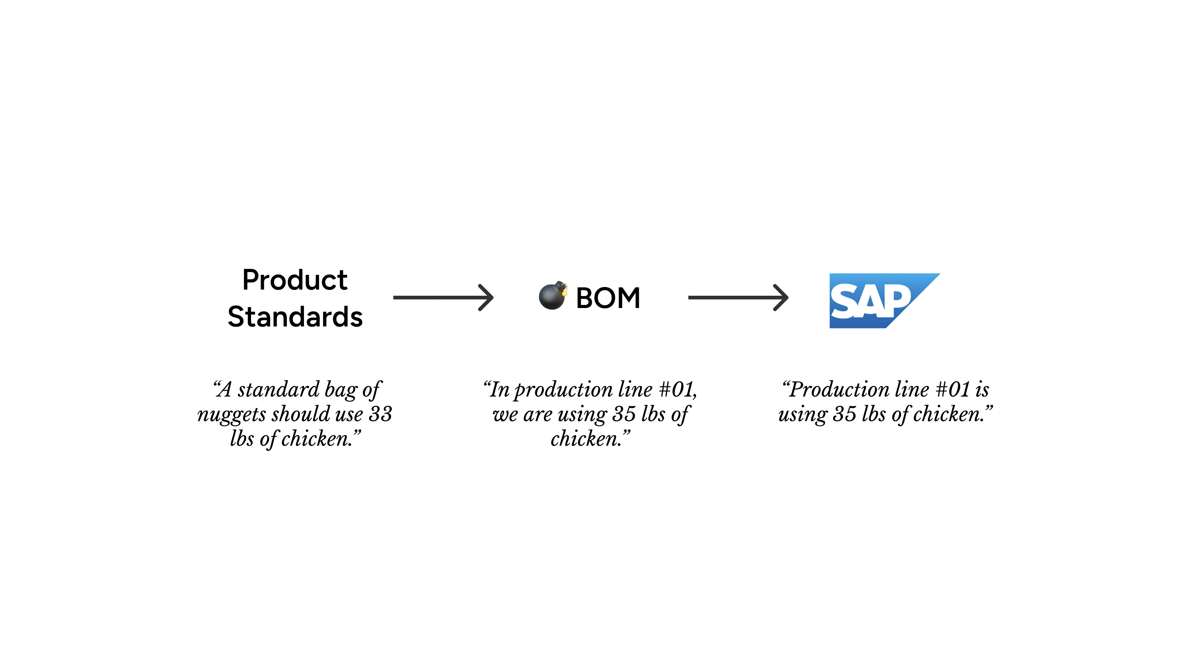
The Bill of Material (BOM) Portal, as it’s name suggests, records all the cost of ingredients to make products. In today’s technical jargon, it is an ERP (Enterprise Resource Planning) system that manages the production process of Tyson’s food products, such as chicken nuggets.
BOM sits at the heart of Tyson’s production process. It gets product standards (think of recipes) from one system, records actual production data, then sends everything to SAP.
 [fig 1] BOM and it's connected applications.
You might wonder: why don’t we just use SAP? Why do we need this extra layer? The answer ties to BOM’s true values that couldn’t be achieved by SAP alone:
- A protective wall that prevents unauthorized changes to SAP
- An interface that matches how production actually works at Tyson
The Challenge: Same Old Problems of Every Enterprise App
Overtime, just like any other legacy app, BOM accumulated more and more tech debts — slowness from a growing database, incompatible APIs with other apps, and so on. Finally the day came when Tyson decided to do a complete remake of the app, and I was brought in to make it more user friendly.
Although the initial ask was vague, I started by sitting with users to observe their daily workflows. The more users I talked to, the clearer the core problems became:
- Speed: The loading time made simple tasks take forever
- Complexity: Users struggled to find specific information in tangled data tables
- Uncertainty: Users constantly worried about accidentally editing data, or data not syncing with other applications
My Approach: Finding Patterns in the Daily Grind
While the core problems were clear, solving them wasn’t straightforward. BOM had countless workflows and edge cases — too many for one neat “problem-solution” story. Instead, I found myself working on a variety of design improvements every sprint. Although those improvements might impact different workflows, they followed the same broader principles:
- Helping users see the forest and the tree — keeping it clean and easy to navigate
- Always showing user what’s happening
- Finding design opportunities in engineering constraints
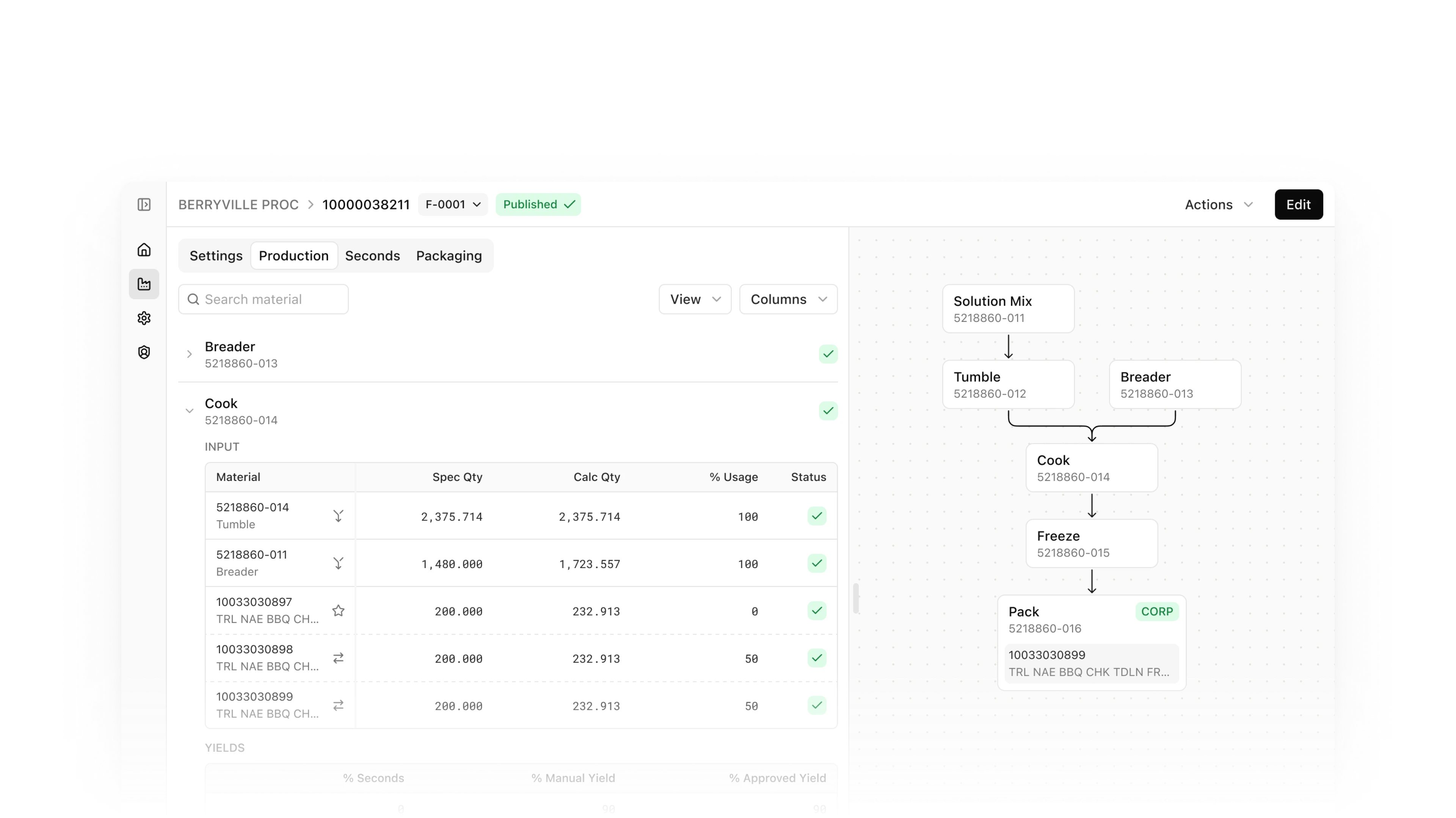
Helping Users See the Forest and the Trees
One of the most challenging pages for BOM portal was the detail page — tables upon tables of data-heavy information. Users needed access to all of it, but not all at once. The challenge then became: how might we keep the page clean, while enabling users to navigate to specific data easily?
My solution came in 2 parts: hide & navigate.
I used accordions to hide the overwhelming data tables, keeping the page clean by default. I then used a flowchart as navigation to specific data within each step. This way, users could see the big picture and drill down when needed.
[video 1] Flowchart navigation in action.
Always Showing User What’s Happening
“We don’t have a set of steps that we have to complete every single day... there’s a ton of different scenarios that we could face.” — BOM user during interview
Despite all these unpredictable scenarios, one thing remains constant — users need to know what happened in the past, what’s happening now, and what can they do next.
Showing What’s Happening Now — Building Confidence Through Edit Mode
One observation I had from the interviews was that users were stressed about accidentally editing data. This was because, in the old BOM, once you clicked a data field, you edited the data — you already messed up before even knowing it.
The solution was simple: edit mode. Users could only view the data by default. To edit, they had to click “edit”. To save changes, they have to click “save”. And there was a constant reminder: “Hey, you are editing this right now.”
Yes, it added more clicks, but it relieved stress, giving users more confidence navigating through BOM.
[video 2] Edit mode.
Showing What Happened in the Past – Status Chips
“I just want changes, I don’t want, you know... just don’t tell me everything.” — BOM user during interview
Users relied heavily on the status of each element to know what happened. In the new design, I used colored chips as the main status indicators. They are added to each data field, so that users get immediate visual feedback for every status change.
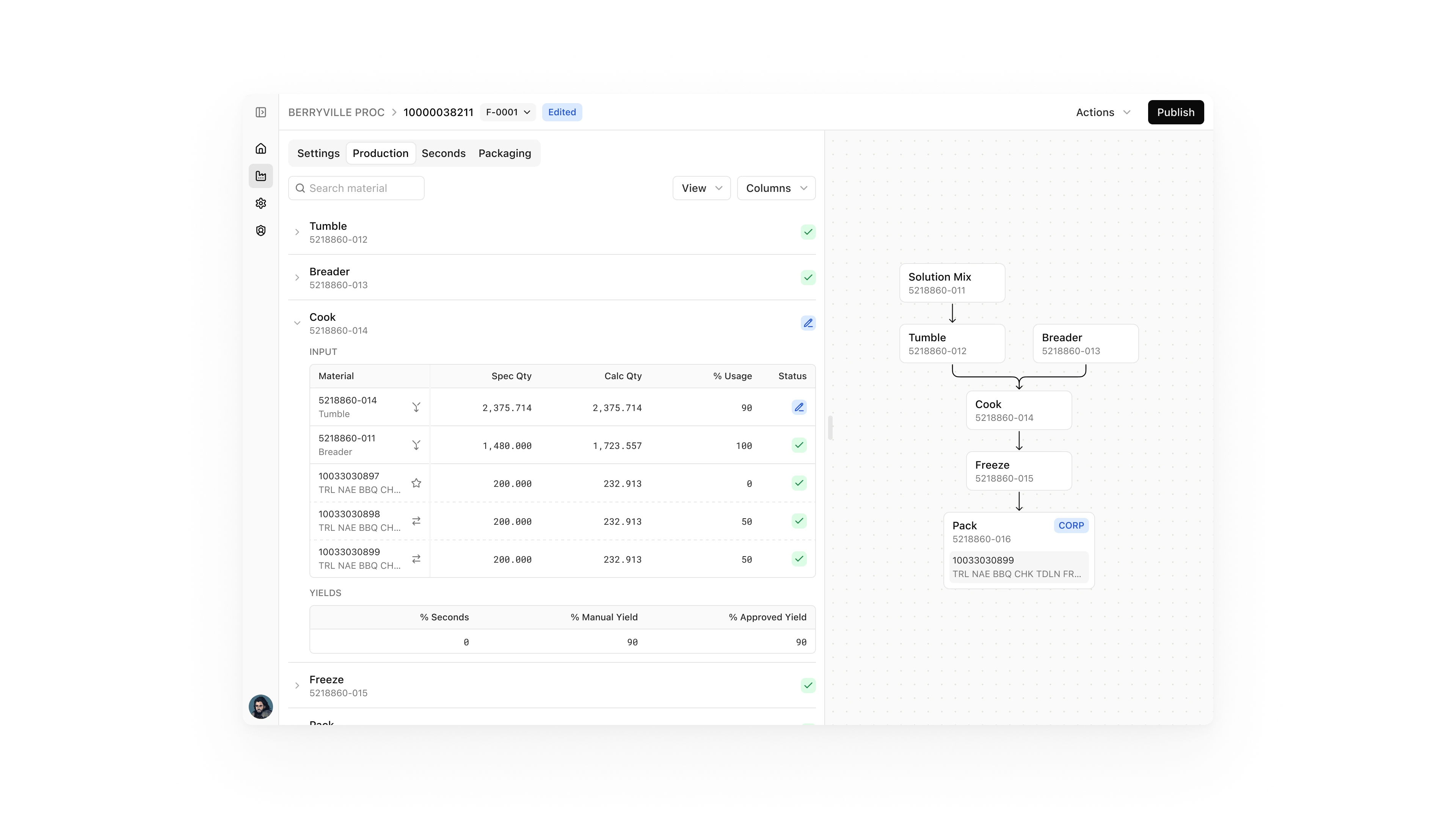 [fig 2] Using status chips to show what data has been edited.
Showing What Can They Do Next — Highlighting Actions
I also added a nice touch of highlighting the actions when users select certain items. Before, all the actions were hidden in an “action” drop-down in a corner. Now the available actions light up immediately. Simple, but responsive and intentional.
[video 3] Highlighting actions when user selects certain items.
Finding Design Opportunities in Engineering Constraints
Speed is always one of the main issues with legacy apps, especially data-heavy ones. Although this isn’t a problem that can be solved by design, it has a huge impact on the overall user experience. Same problem with BOM. Almost all users complained about the speed at least 10 times.
Why was it always so slow? Well, we needed to load too much data, the engineers explained. So they suggested we should load only what we need — one plant at a time.
[video 4] Solution suggested by engineers — user has to select a plant to continue.
But this way, the home page would just be an empty page. Emptiness itself wasn’t a problem, but it’s a waste of space. And efficiency, in both space and time, is key in designing enterprise products.
We can surely do something more than just a sad blank canvas.
Loading all the data was expensive, but loading only a list of plants wasn’t. So I redesigned the home page with a few helpful little things: a summary of the user’s workload for the day, a list of saved plants, and a greeting message that isn’t necessary but adds a sense of warmth.
[video 5] Updated solution with a nicer home page.
Overcoming Stakeholder Hesitation
The Problem
While the first batch of design pages was completed, we had several rounds of review meetings with our main stakeholders, who oversee all the users but also users themselves. They kept confirming every tiny detail, which stretched our review sessions to an endless amount of time, and wouldn’t give us the “green light” to move on to development.
The Solution: Agile Mindset and Trust
At our last review meeting, the product manager and designers delivered a message about the agile mindset, hoping to finally get the approval signal to move forward. The message was simple: it’s not possible to get everything perfect the first time, we have to start building, knowing we can always go back to fix and improve the app later. The legacy app would still be available as a fallback option if anything went wrong.
In addition to this agile approach, we had already been building trust with our stakeholder — listening to their pain points and making updates to the design over the last couple of months. We showed them that they could trust us and feel comfortable going through this agile process together.
The Result
During that meeting, after we clarified the agile mindset, the stakeholders were finally comfortable with us moving forward with the MVP development.
Going Forward
Currently the new version of BOM is still in development. We’ve had excellent feedback from usability testing — users were notably more confident and efficient — and we’re working to implement analytic tools to capture quantitative metrics going forward.
Looking back, I'm grateful to have worked on this complex, data-heavy project that sits at the heart of how Tyson makes food. The challenges along the way helped me grow into a better designer who can transform messy, complex scenarios into clean, intuitive designs — making this “giant excel sheet” easier to work with for day-to-day users.