Access Request System Redesign
Simplifying how people ask for access at Tyson Foods.
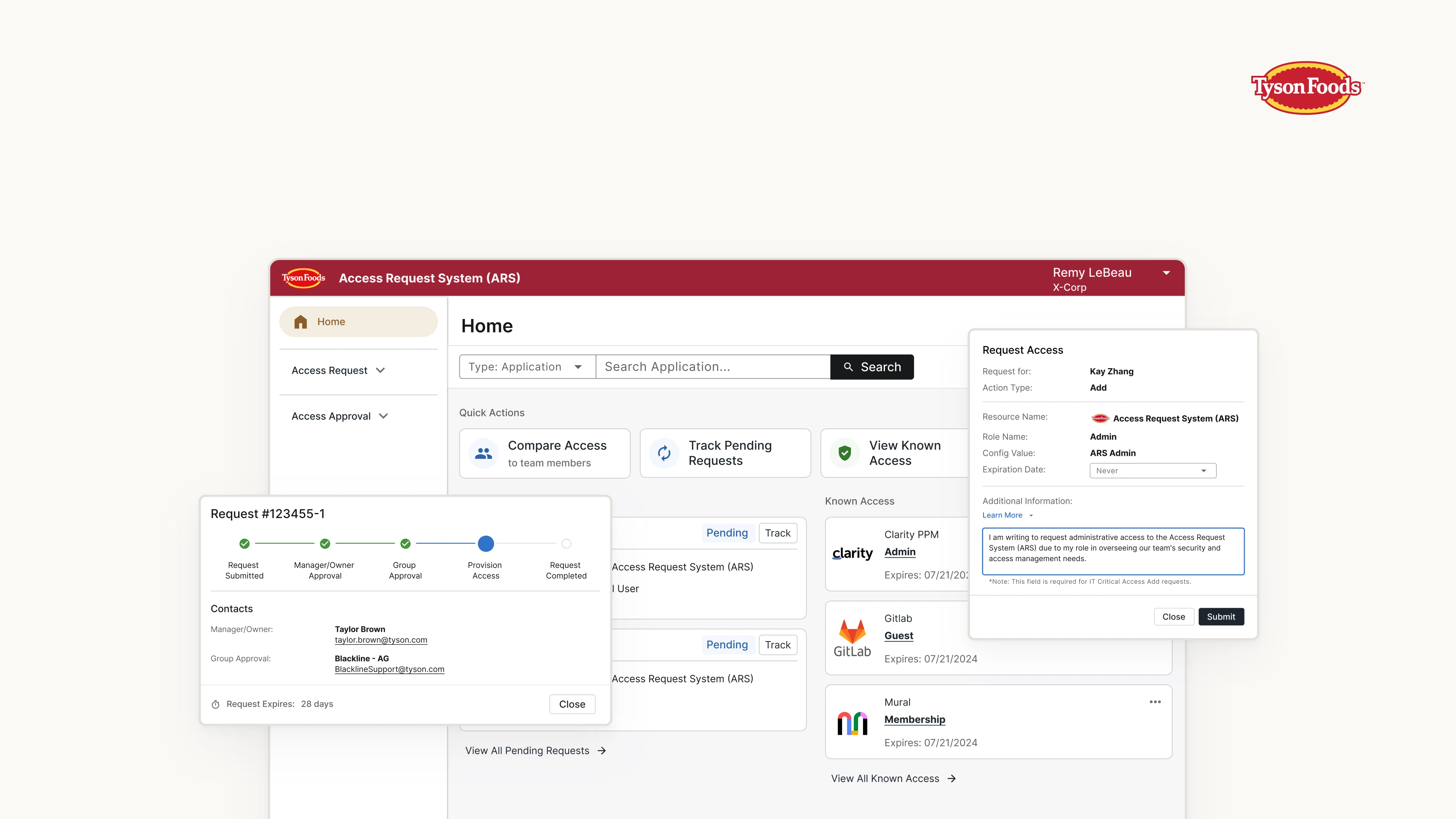
Overview
- Goal: This redesign project aims to transform the Tyson Access Request System (ARS) from a legacy complex maze into a sleek, intuitive enterprise SaaS application.
- Impact: 30% ~ 50% steps reduced performing average tasks. 69% of users reported performance improvement.
- Timeline: July 2023 ~ March 2024 (First Launch)
- Deliverables: User Research Insights, User Interface Design
- Team
- Kay Zhang (Me), UX Designer
- Theresa Sanders, Product Manager
- Shelly Gardner, Senior UX Designer
- Austin Dixon, Database Specialist
- Kranthi Kishore, Lead Developer
- Front-end Development Team of 5
What is ARS?
If you are a team member at Tyson Foods, and you need access to a specific digital resource. You need to go through our Access Request System (ARS). Search for the access you need. Make a request. Wait until it gets approved. Done.
The Problem
But when you log into ARS, you will see complex navigation, poor usability, super slow loading speed, along with outdated visuals.
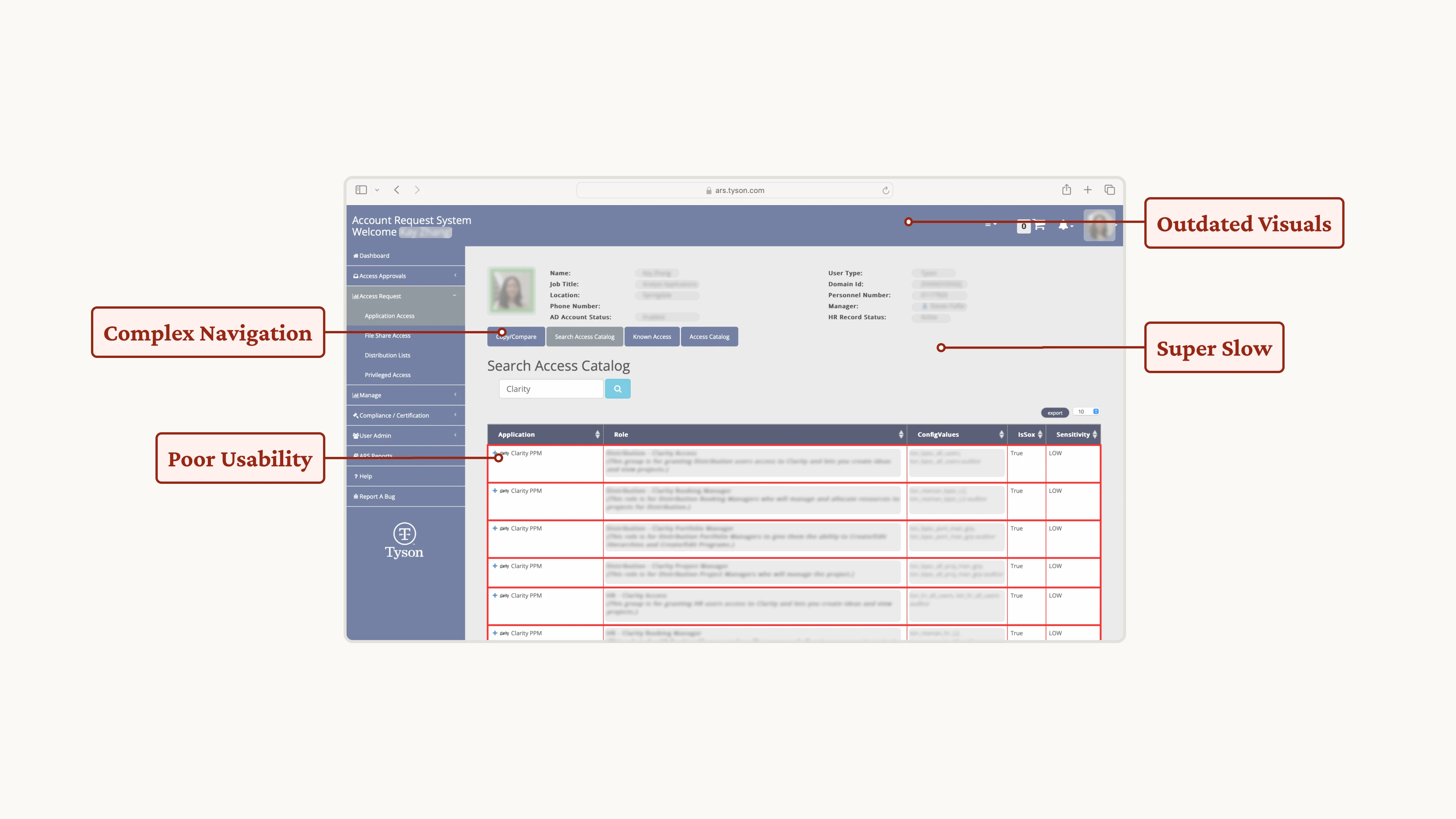 [fig 1] Outline of ARS's current problems.
Our Goal
Not just the visuals, but the flow.
Complaints from our team members were heard. The UX team was brought into this project to do a complete design upgrade.
And speaking of design upgrade, we don’t want to just update the visuals and call it a day.
Instead, we focus more on upgrading the whole process and hoping to save user’s time and sanity.
What's the Plan?
We followed an agile development flow, we could go back at any stage and iterate, and possibly with some chaos in the mix.
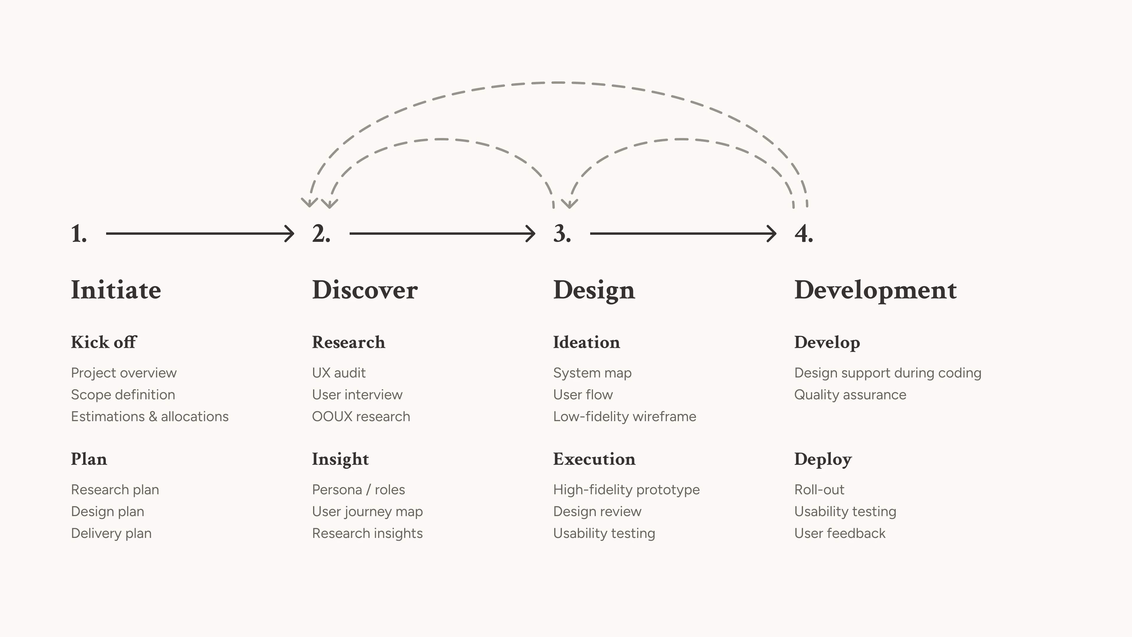 [fig 2] Process overview.
Discovery - What Should We Know?
Before jumping right into the redesign, we need to better understand the problem space. Our discovery research is unfolded in 2 parts:
- Understanding the User, by conducting user research.
- Understanding the System, by doing Object-Oriented UX and aligning with stakeholders.
User Roles
Before any research, we Identified 4 roles in the current ARS. After discussion with stakeholders, we prioritized the roles and decided to start with Requestors, then slowly extend to Manager, Resource Owner, and finally Admin.
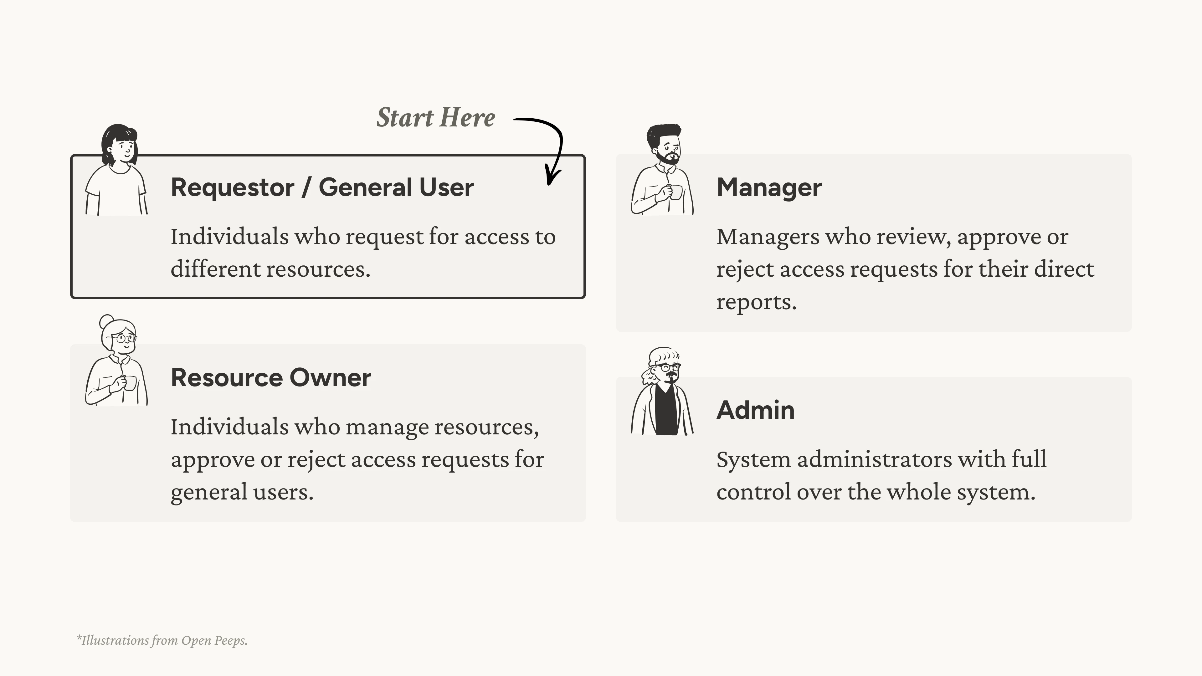 [fig 3] User roles.
User Interviews
Now let’s start with Requestor users. We interviewed 7 users from various backgrounds, from interns to plant managers, observing how users do their daily tasks, identifying needs and pains.
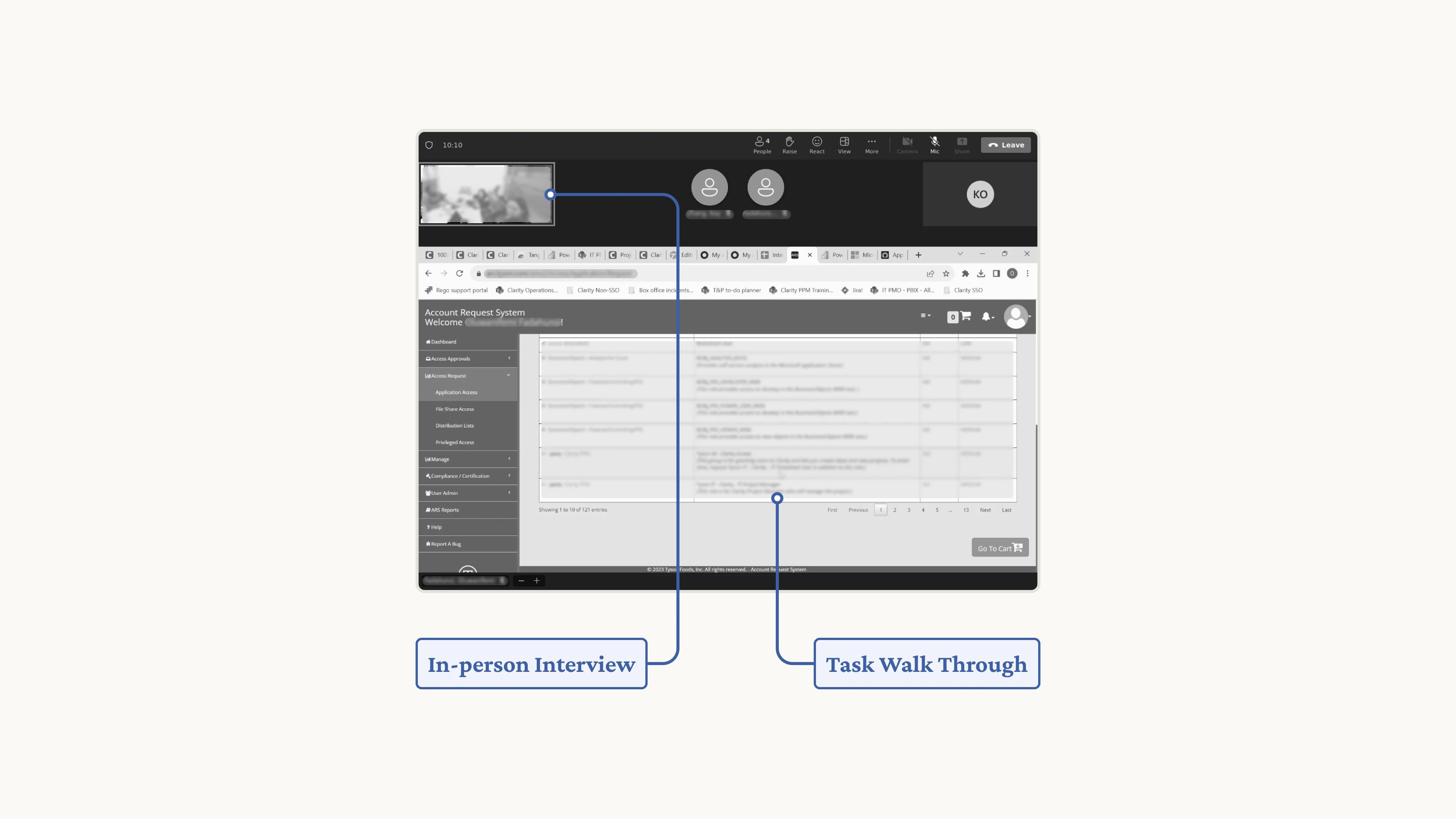 [fig 4] A snapshot of the user interview process.
Use Cases
From there, we observed 3 common use cases: requesting for a specific access, onboarding a new hire, and following up on a request.
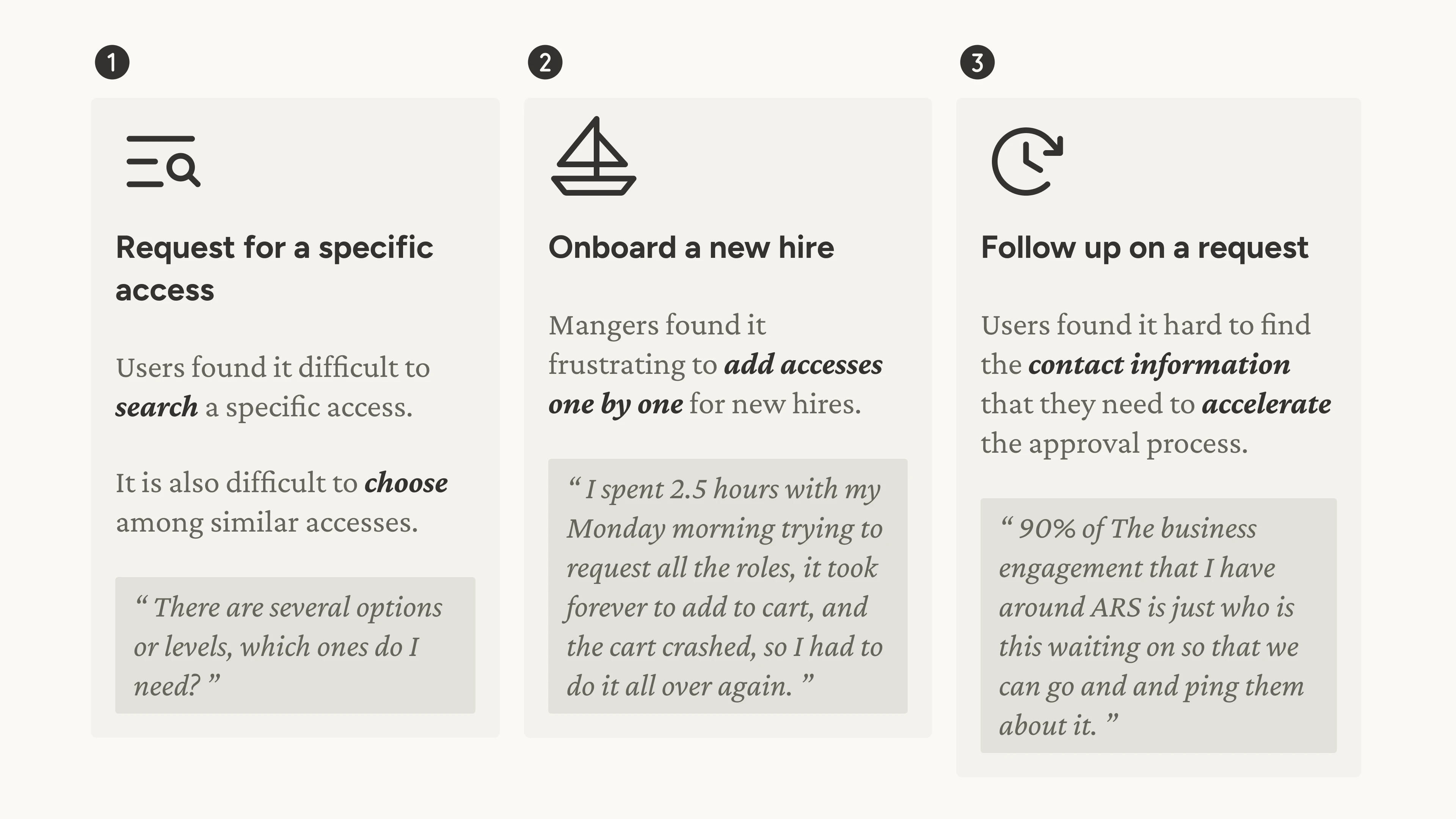 [fig 5] Use cases.
Object-Oriented UX
In parallel to understanding the user, we also researched into the system. We conducted Object-Oriented UX (OOUX) research, bringing together Product Managers, Backend Developers, and Database Specialist to untangle the complexity of the current system by identifying:
- Objects
- Relationships
- Call-to-actions
And what’s great about OOUX is that it also help aligning the user’s mental model to the system’s data model, guiding upcoming UI designs.
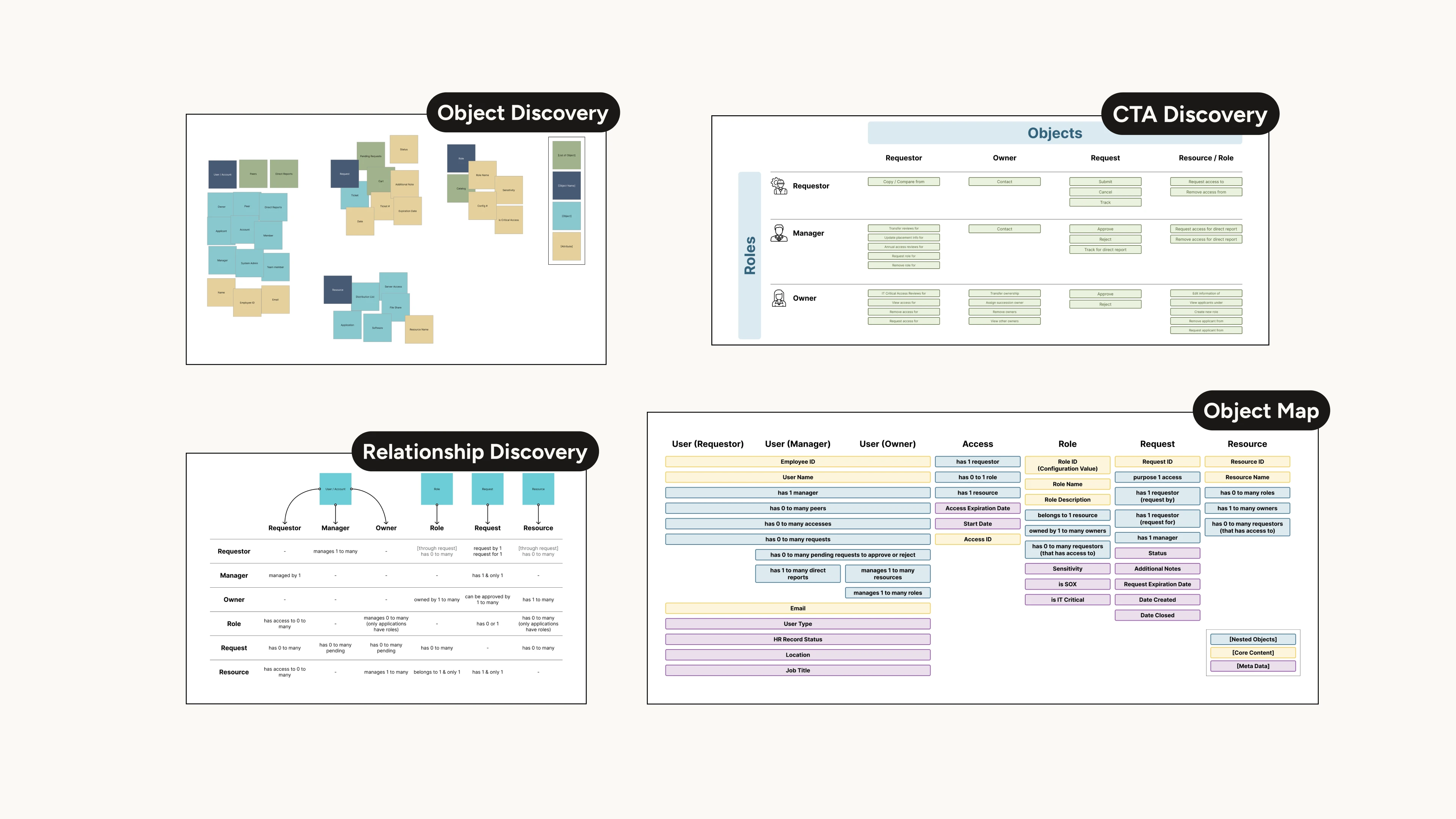 [fig 6] A glance of OOUX artifacts.
Ideating High-Level Action Points
Bringing the research all together, we condensed the insights into 4 high-level action points that guide our ideation and design process:
- Surface Actions
- Enhance Search-ability
- Batch Actions
- Provide Feedback
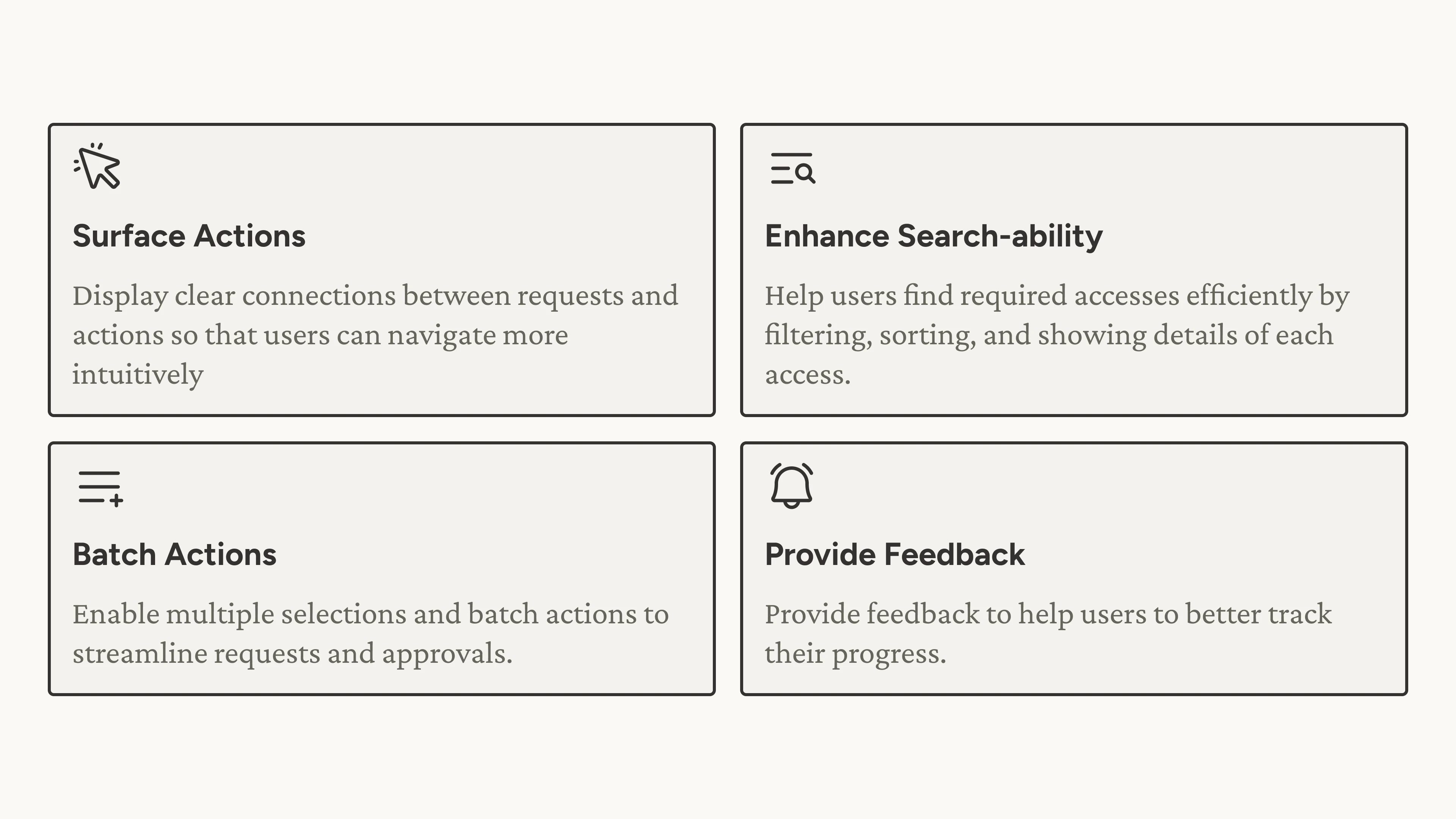 [fig 7] Action points.
Ideating the Flow
We started ideating and see how we can surface actions and simplify the user flow.
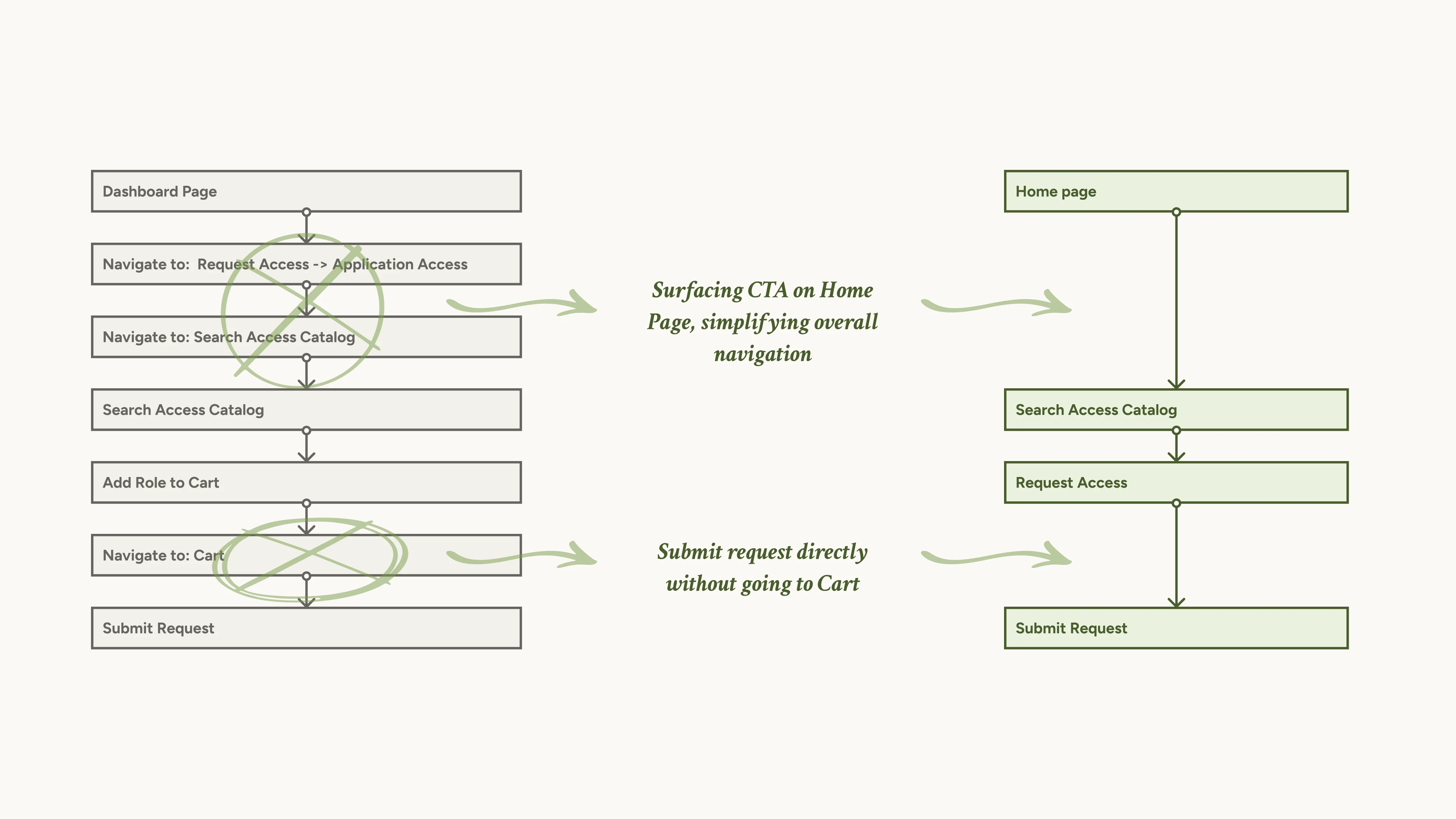 [fig 8] A snapshot of how to simplify the user flow.
Brainstorming the Data Table
We also started brainstorming how can we improve search-ability and add batch actions on data tables.
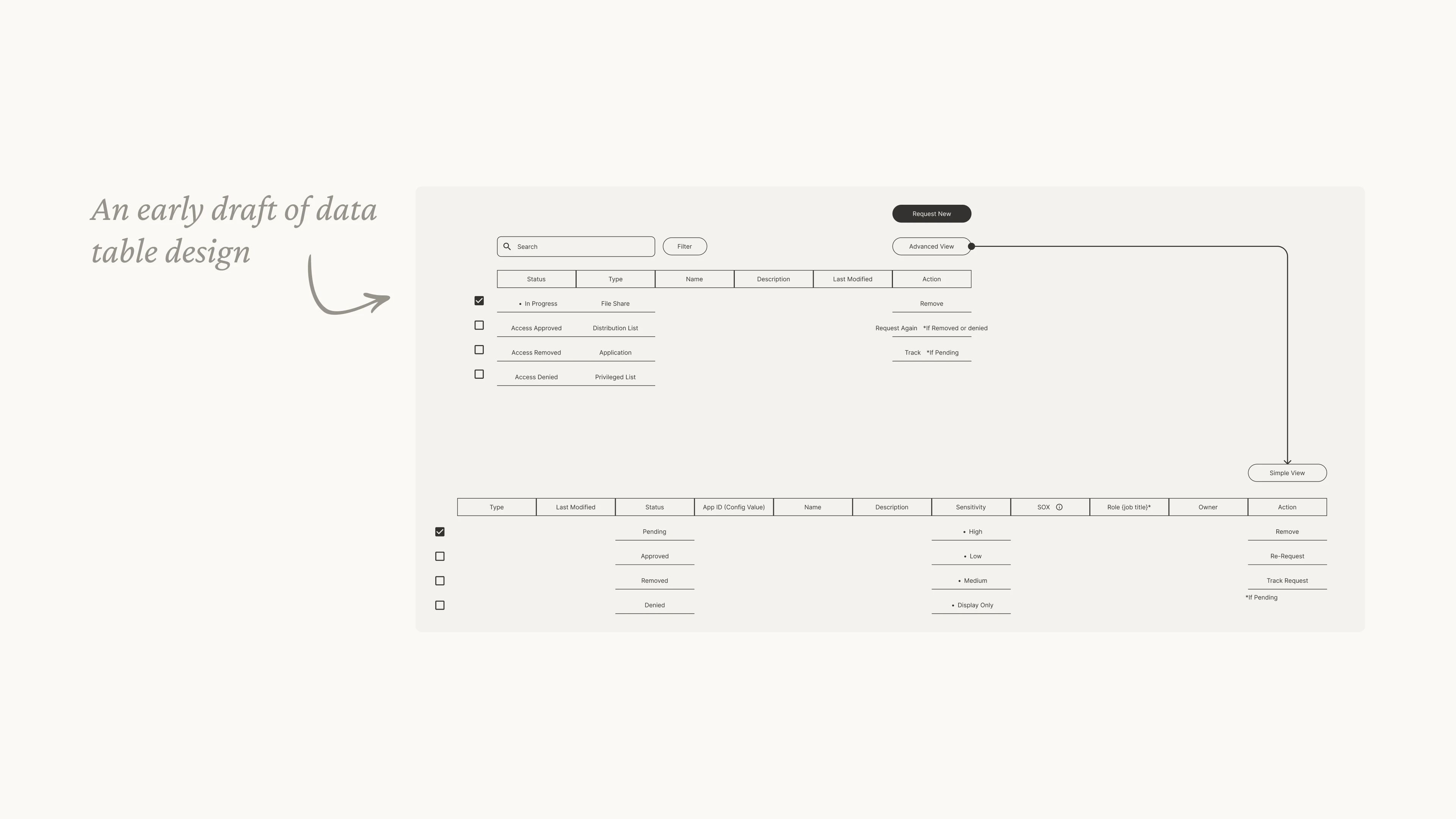 [fig 9] A draft of data table design.
OOUX Wireframes
As mentioned earlier, OOUX comes in handy when ideating wireframes using the concept of objects, relationships and call-to-actions.
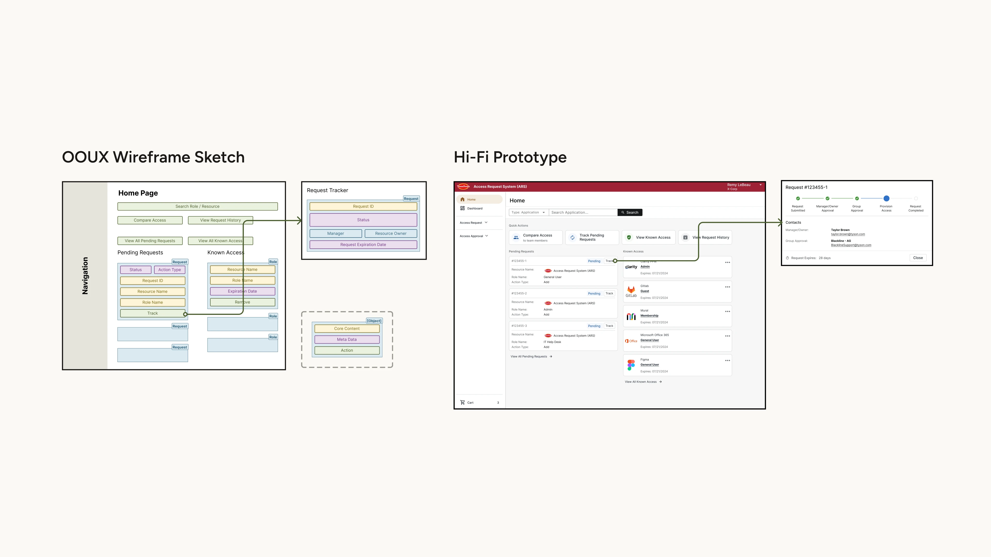 [fig 10] Examples of how OOUX wireframe guides the final UI design.
Now showing some highlights of our final design craft:
Design Highlight 1 - Surfacing Actions
To shorten the user's action path, we did a complete re-design of the home page, and we also enable users to skip the cart when they are only requesting for one item.
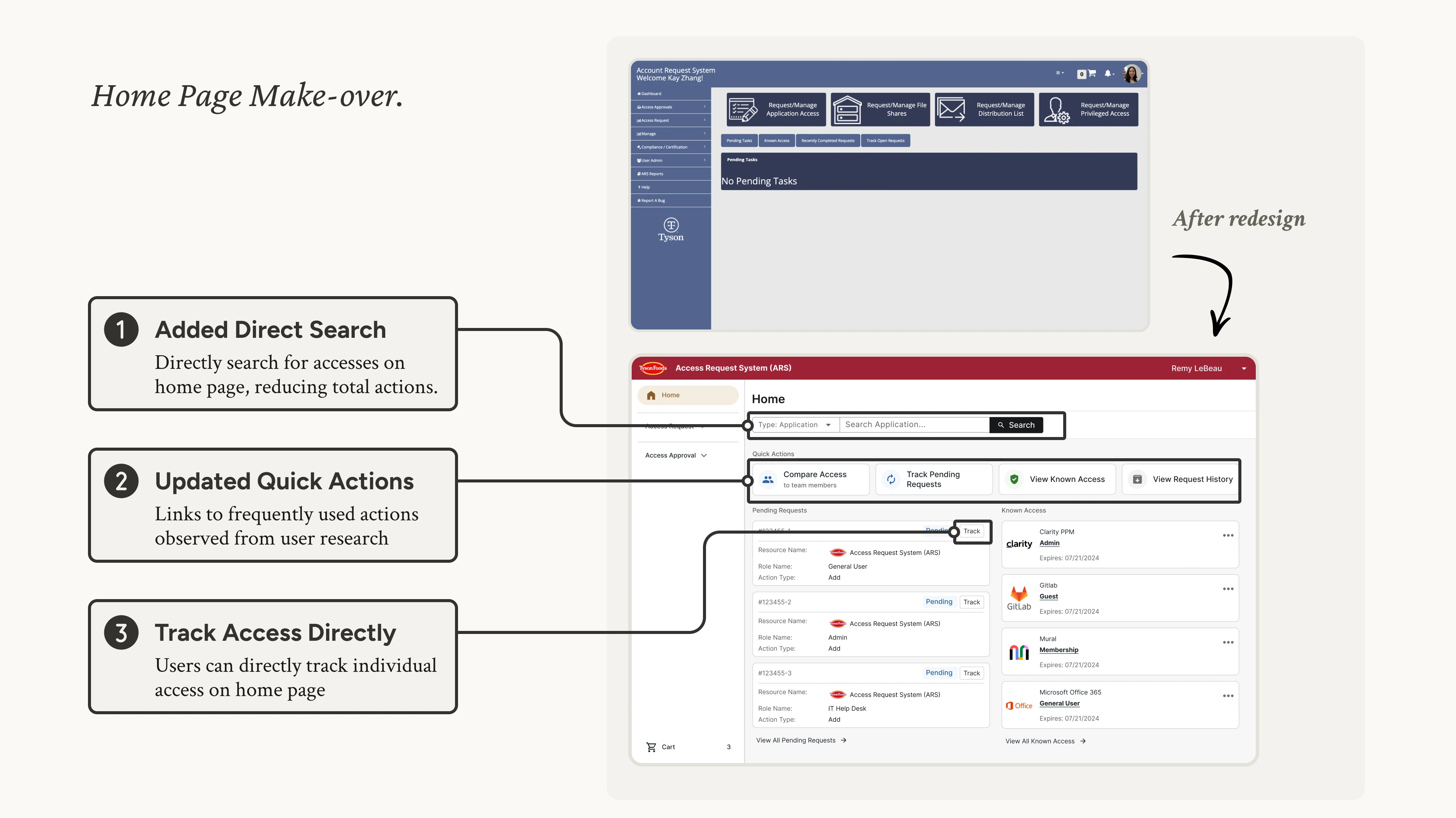 [fig 11] Redesign of the home page.
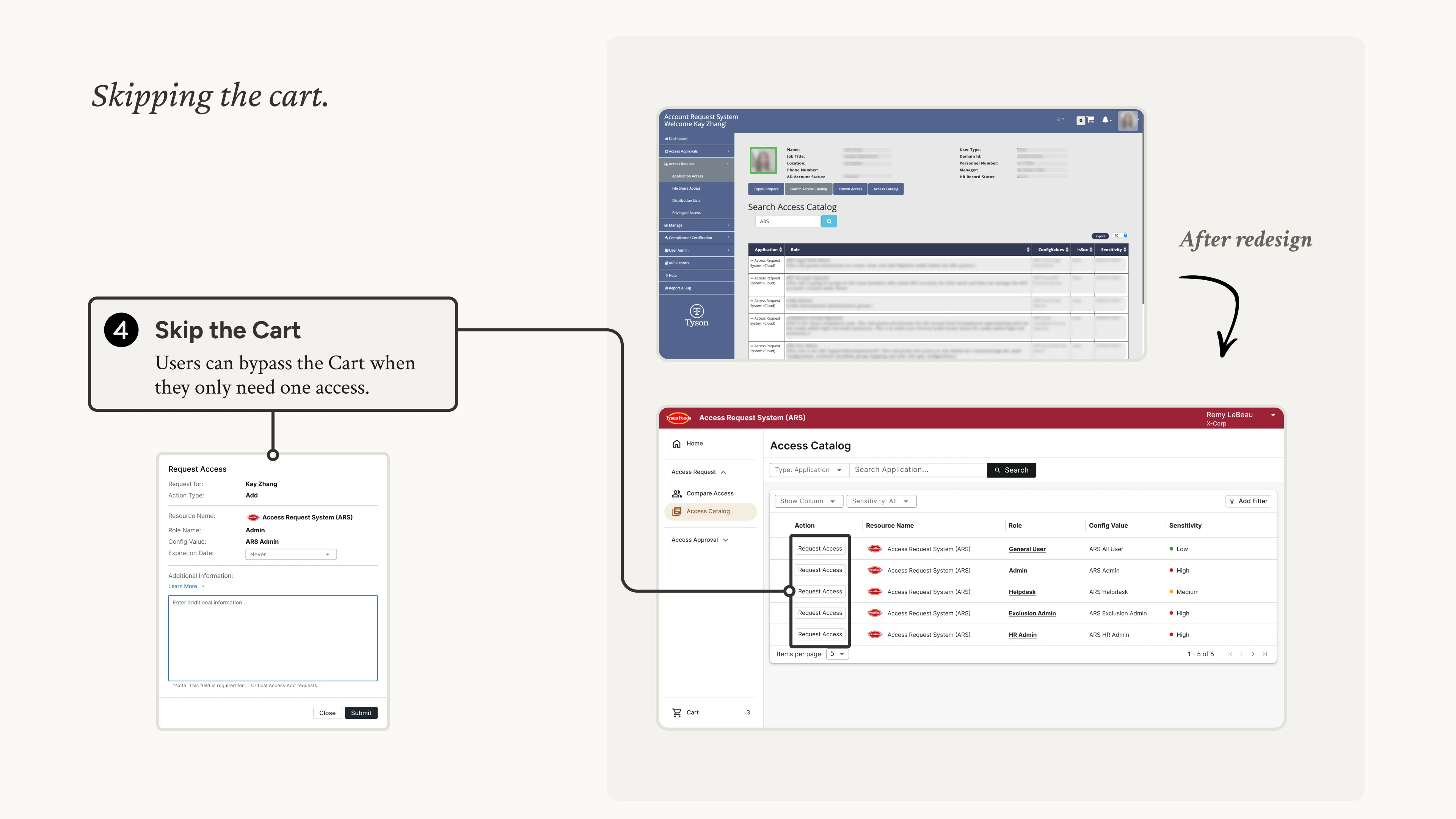 [fig 12] Skipping the cart to add access.
Design Highlight 2 - Enhancing Search-ability
To help user find accesses more efficiently, we added sorting, filtering and expanding details on the data table. We also added profile images for users to better recognize team members.
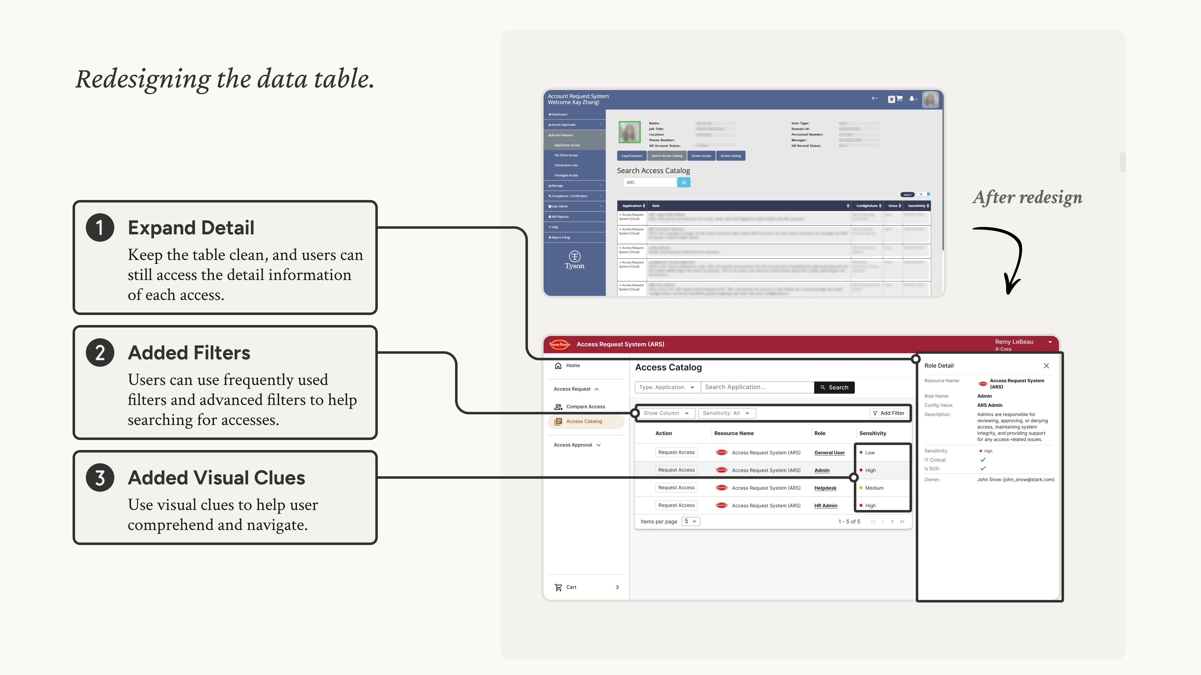 [fig 13] Redesign of the data table.
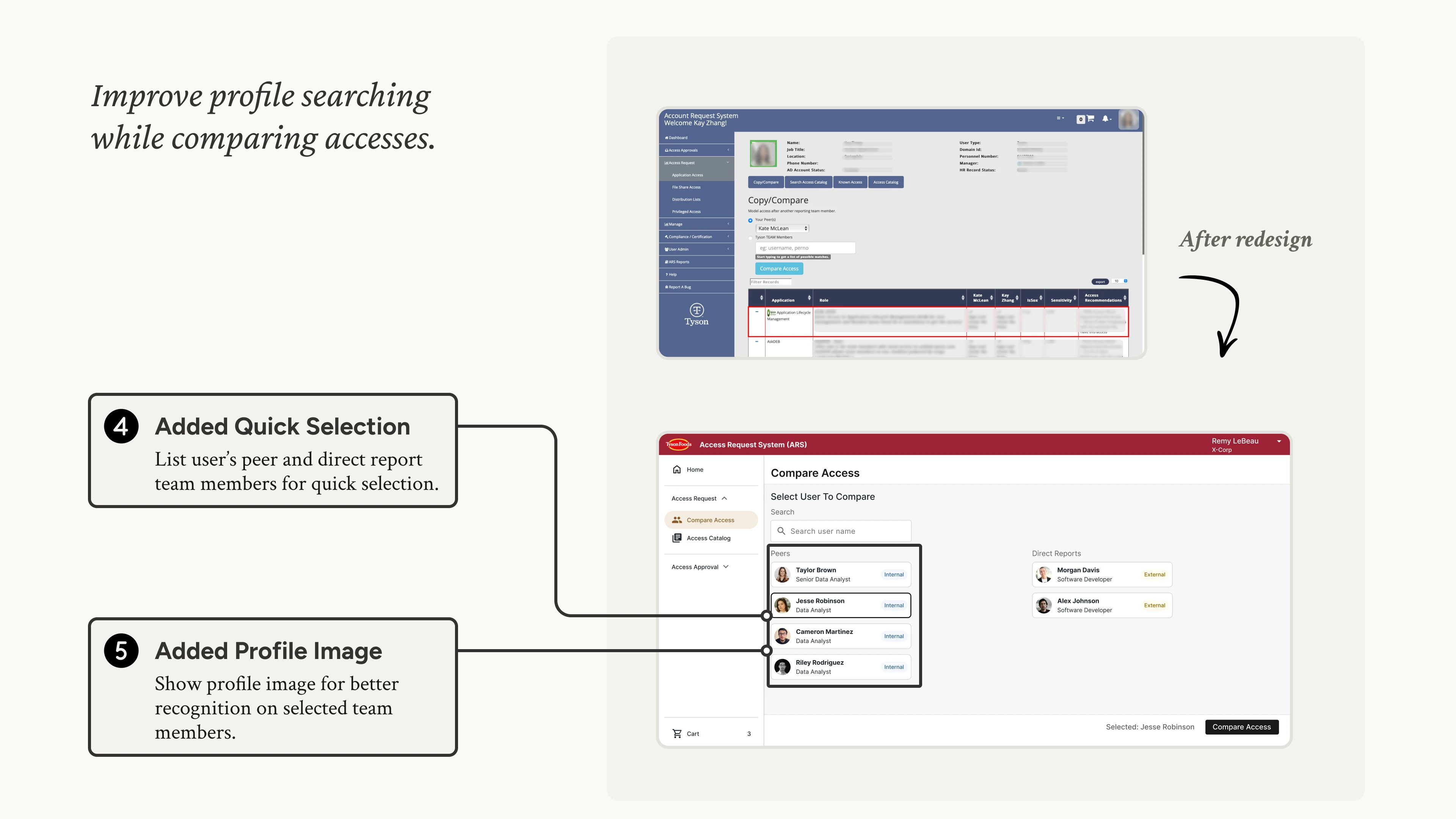 [fig 14] Adding user profile image.
Design Highlight 3 - Batching Actions
To ease users from selecting multiple accesses, we added batch actions on data tables.
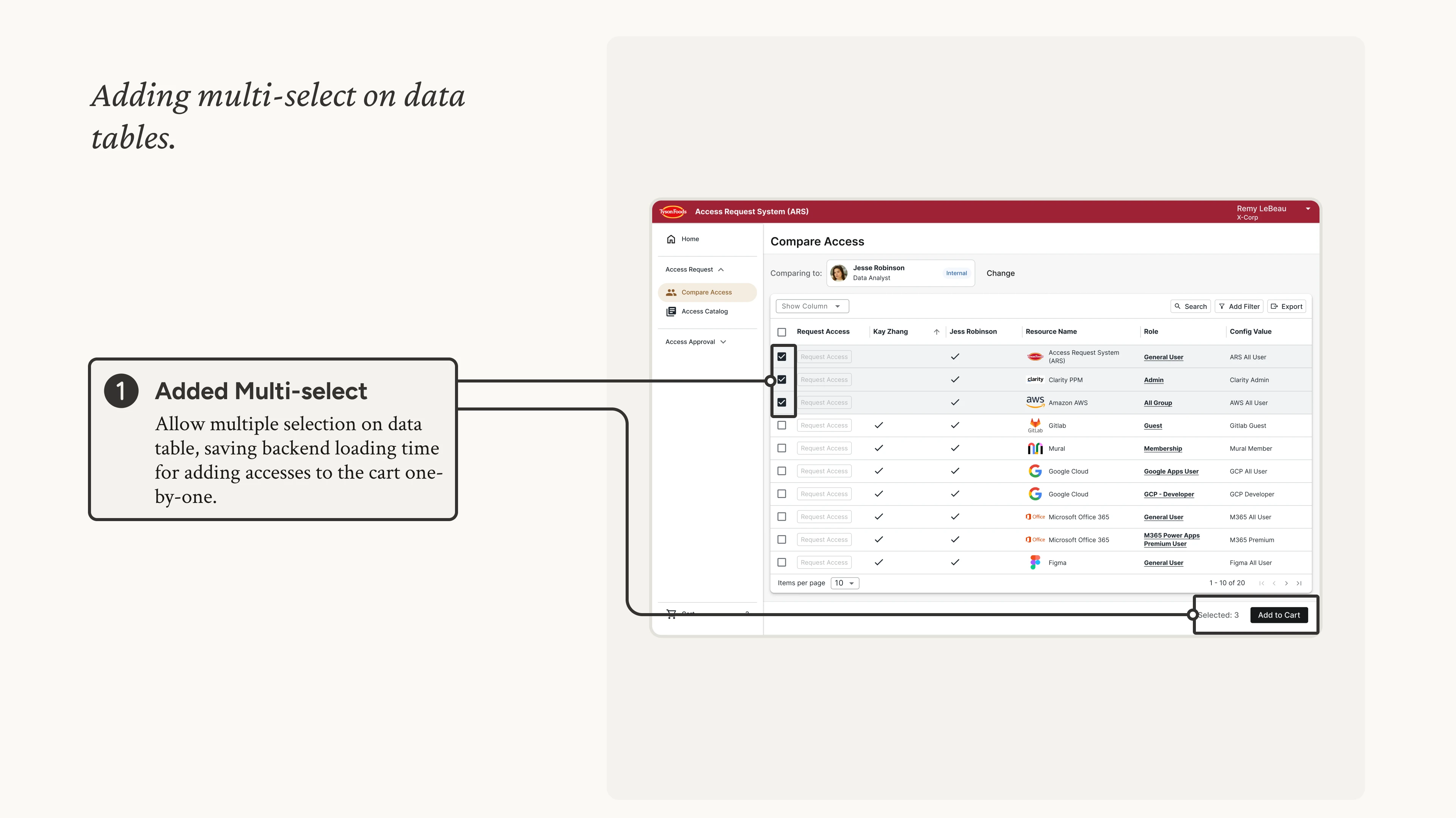 [fig 15] Batch actions on data tables.
Design Highlight 4 - Providing Feedback
To let users easily track their requests, we added request trackers.
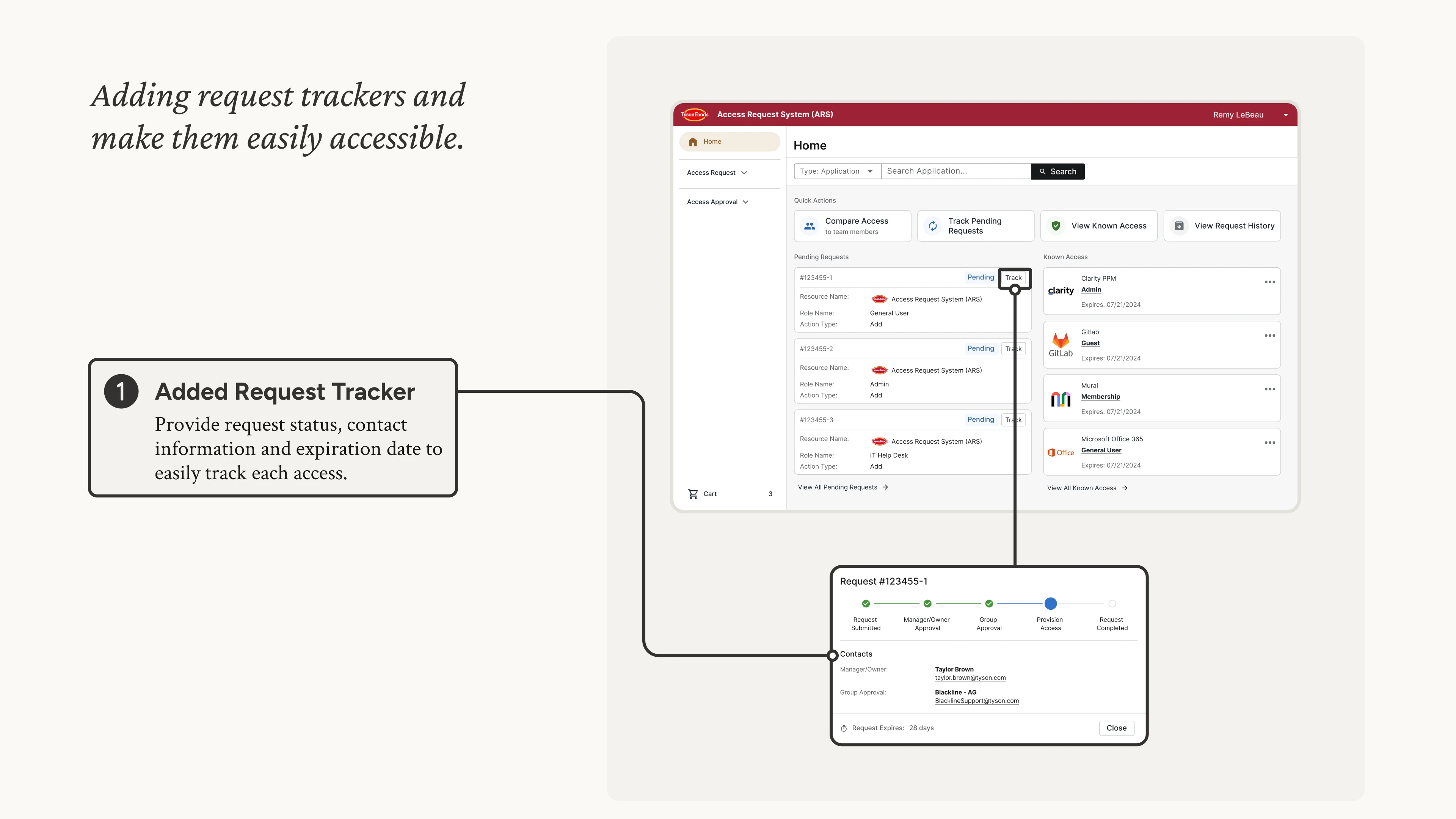 [fig 16] Tracking request status.
Usability Testing
Immediately after designer reviews, we conducted a couple Guerrilla Testing sessions with colleagues in our office building.
We observed how users interact with the new design, noting down any possible areas of improvement.
Now showing some iteration highlights...
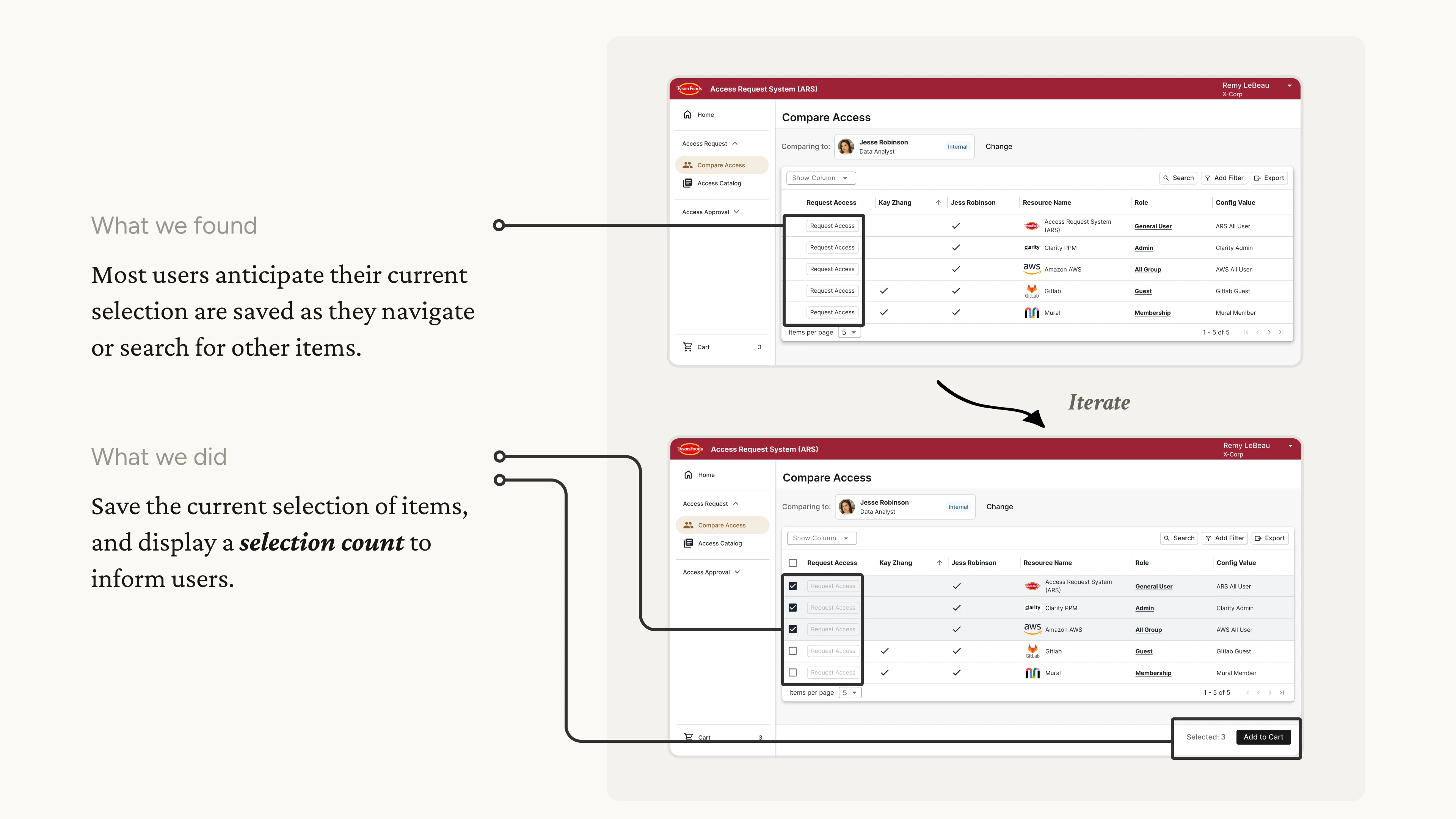
Iteration Example 1 - Auto-save Selection
Adding auto-save and selection count in multiple selections.
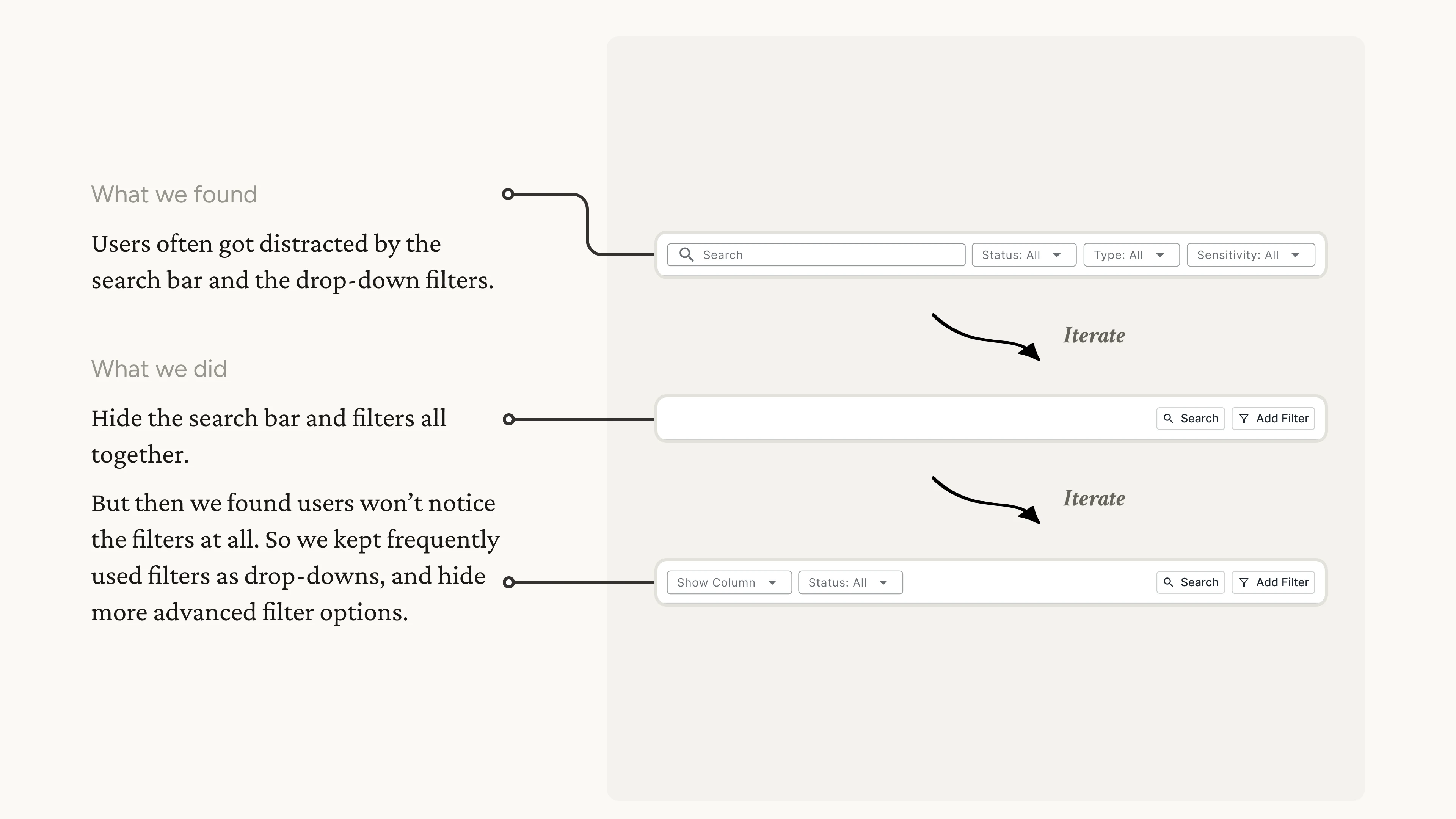
Iteration Example 2 - Table Toolbar Iterations
Iterating on the table toolbar based on observations of user behaviors.
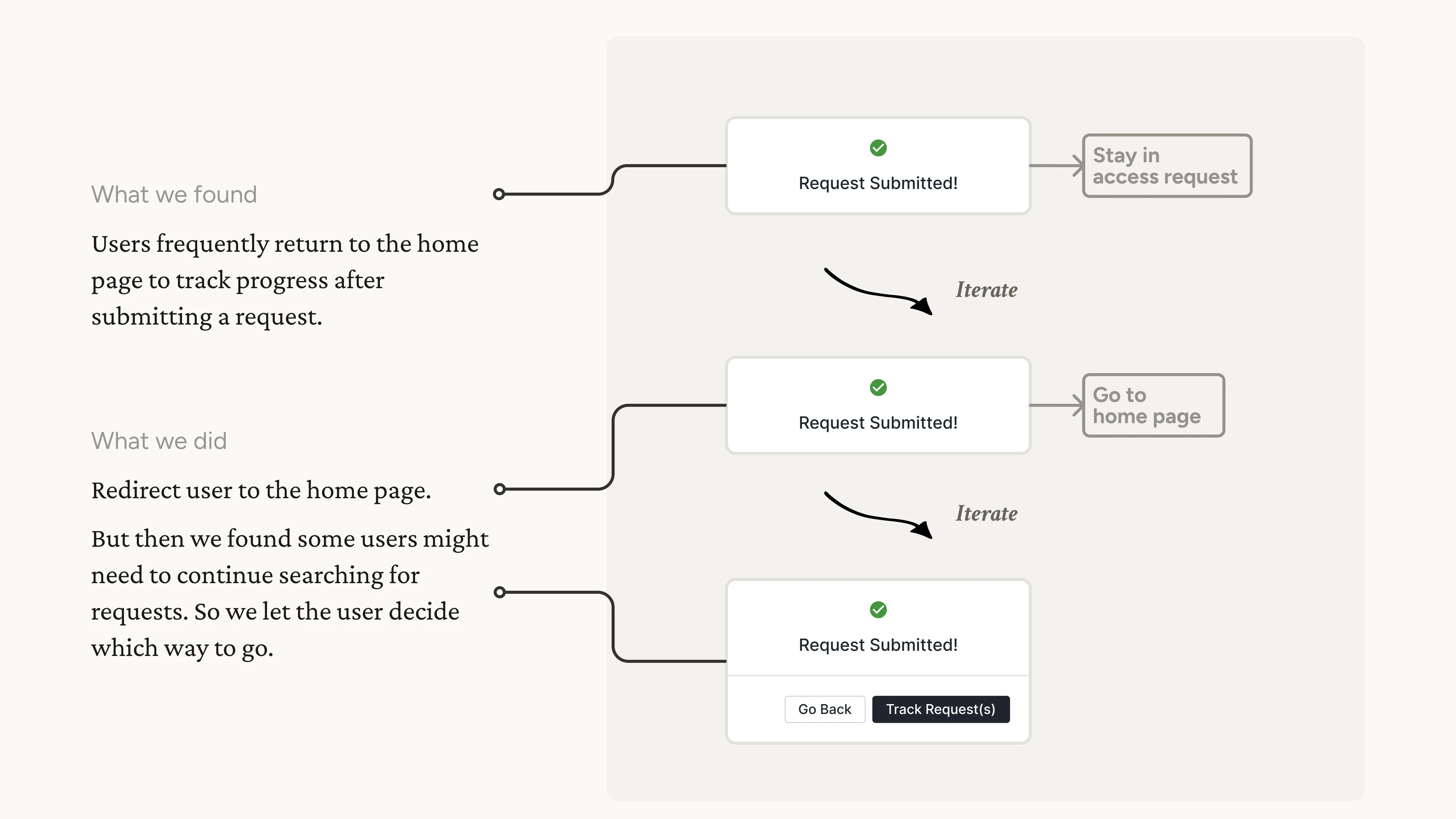
Iteration Example 3 - Redirection
Iterating on the redirection after submitting a request.
Result
The ARS beta version was launched in March 2024 to over 1500 Tyson users.
For the primary task of submitting requests, we achieved a 50% reduction in the steps required. Similarly, for other tasks within the system, we reduced 30%~50% steps on average, enhancing the app's overall efficiency.
We also sent out a satisfaction survey on July 2024 to all beta users, gathering their honest feedbacks. We got 91 responses, and the result shows 69% of users reported that the performance has improved.